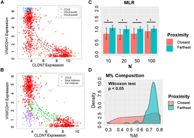
FIGURE 7.
Distinguishing between hybrid E/M cells vs. mixtures of E and M cells. (A) Scatter plot showing CCLE cell lines that display a hybrid E/M phenotype (red) on the mixture curve (dotted curve) determined by the mean of 35 pure E (orange) and pure M (blue) reference samples in CCLE dataset. (B) Scatter plot showing the 100 farthest (purple) and 100 closest (green) samples based on the distance from the mixture curve. (C) Bar plots showing EMT scores of N (10, 20, 50, and 100) closest and farthest hybrid E/M samples from mixture curve. (D) Mesenchymal proportion (%M) distribution of the 100 closest and farthest hybrid samples from mixture curve. *p < 0.05, N = 10, 20, 50 and 100, two-tailed Student’s t-test; error bars represent standard deviation.

