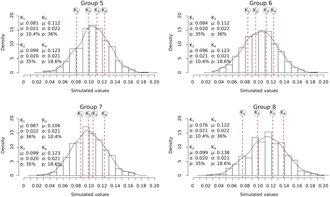
Fig 8. Density bar plots showing the distribution of simulated values for the four-component samples.
Black curve: the density curve for each sample, vertical red stapled lines: the position of the mean of each component (simulated morphotype) Kn. K1: component/morphotype 1. K2: component/morphotype 2. K3: component/morphotype 3. K4: component/morphotype 4. μ: the component mean. σ: the component standard deviation. p: the relative abundance.

