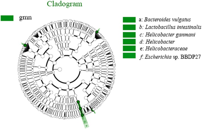
Fig. 8.
Diagram of intergroup difference in taxonomic units based on the classification tree. The cladogram shows all the hierarchical relationships among the taxonomic units from phylum to species. The node sizes correspond to the average relative abundances of the taxa. The green colour indicates a significant difference in the taxa and high abundance in the sample. The letters identify taxa that had obvious differences

