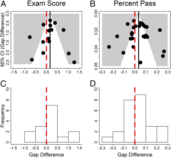
Fig. 3.
Results appear robust to sampling bias. Funnel plots were constructed with the vertical axis indicating the 95% CI for the difference, under active learning versus lecturing, in (A) examination score gaps or (B) passing rate gaps, and the horizontal axis indicating the change in gaps. The dashed red vertical line shows no change; the solid black line shows the average change across studies. The histograms show data on (C) examination scores (in SDs) and (D) percent passing. The vertical line at 0 shows no change in the achievement gap. If the analyses reported in this study were heavily impacted by the file drawer effect, the distributions in A–D would be strongly asymmetrical, with low density on the lower left of each funnel plot and much less density to the left of the no-change line on the histograms.

