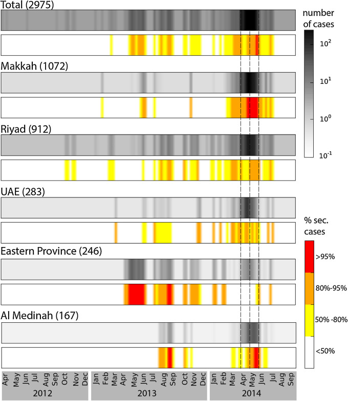
Fig. 4.
Predicted time series of incidence and proportion of secondary cases for the whole Middle East and the five regions with the most cases. For each region the average number of cases is displayed with the grey-scale colour-map, while values for the proportion of secondary cases are colour-coded (white, yellow orange and red) according to the legend. Average number of cumulative cases predicted by the model is indicated on the top of each colormap. Dashed lines indicate the time periods for increased activity assumed by the model.

