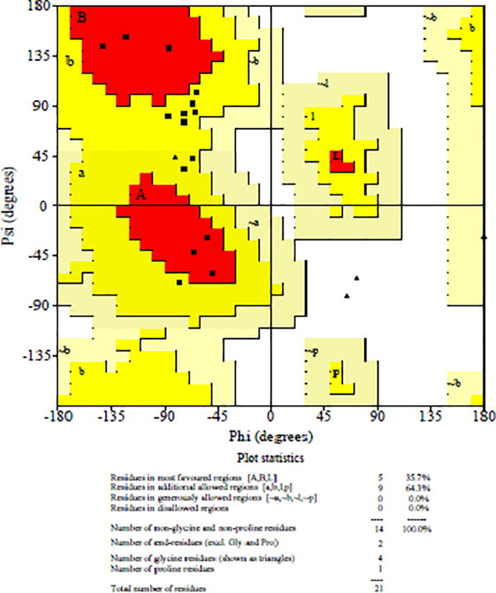
Fig. 11.

Ramachandran plot showing percentage of residues in the most favourable regions, additionally allowed regions, generously allowed regions, and disallowed regions.

Ramachandran plot showing percentage of residues in the most favourable regions, additionally allowed regions, generously allowed regions, and disallowed regions.