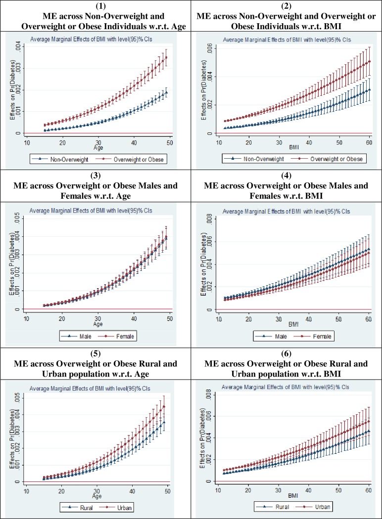
Fig 2. Margins plot for the effect of BMI on the self-reported diabetes status.
Source: Figure constructed by authors. ME = Average marginal effect of BMI on self-reported diabetes status. In all graphs (1–6), the dark dot or triangle represents the average marginal effect of a unit rise in BMI on probability of being diabetic (measured on Y-axis). On X-axis, we have plotted either age or BMI (as labelled in each graph).

