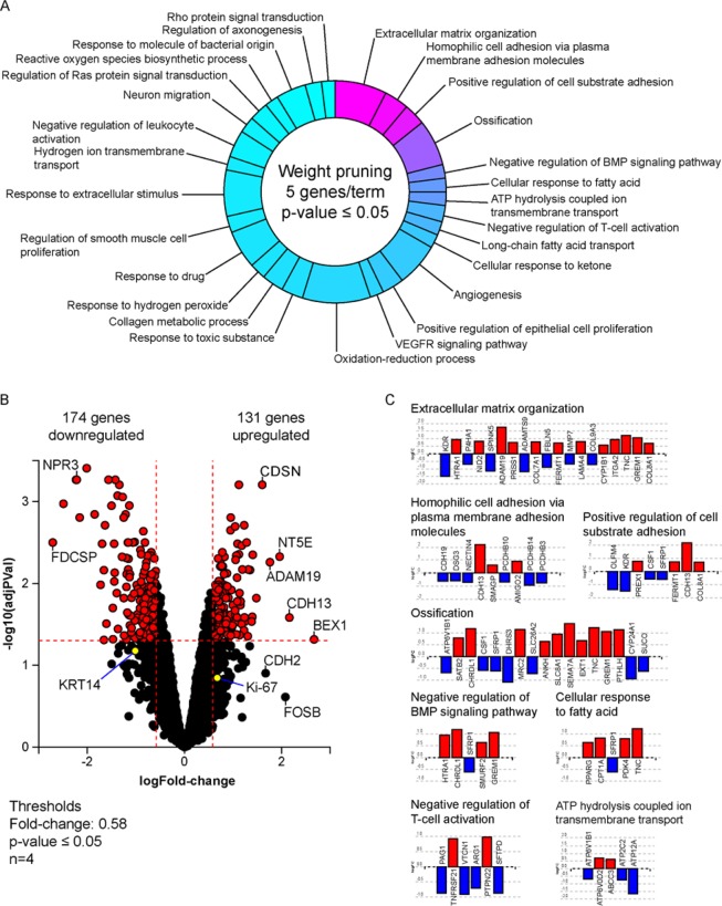
Figure 2.
Differences in gene expression between invading and non-invading subpopulations. (A) Pie chart distribution of biological processes predicted to be affected during invasion based on gene expression profiling. Processes are arranged according to statistical significance, from magenta (lowest) to cyan (highest p-value), using weight pruning method of p-value correction. Processes were defined by a minimum of 5 genes per term with a p-value < 0.05. (B) Volcano plot of genes affected during invasion, displaying expression change (x-axis) in log2FC values with significance of the change (y-axis) represented in terms of the negative log (base 10) of the p-value (more significant genes are plotted higher on the y-axis). Cut-off thresholds in dotted lines were set at log 1.5-fold change in expression with adjusted p-value < 0.05. (C) Expression profile of target genes associated with several of the most significant predicted biological processes with the lowest p-values. Images were generated by the iPathwayGuide software (Advaita Bioinformatics, Ann Arbor, MI).

