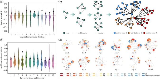
Figure 3.
(a) Degree assortativity for daily OSNs (black dots); and the mean and distribution of the activity foci (colourful violin plot) in each day during the hurricane and flooding. (b) Neighbourhood assortativity for daily OSNs (black dots); and the mean and distribution of the activity foci (colourful violin plot) in each day during the hurricane and flooding. (c) Structural anatomy of daily OSNs for understanding emergent social cohesion and information propagation. (d) Activity focus-level OSNs with the proportions of various neighbourhoods by counting the number of users from the same neighbourhoods. Each pie chart represents an activity focus. The size of a pie chart is consistent with the number of users in the activity foci. The connections between communities depend on the connections between the users in both communities. There are three neighbourhoods without any active users on social media during disasters because there are only a few residents and corresponding registered users on Nextdoor. Meanwhile, a small group of people outside the investigated neighbourhoods joined the communication in disasters. This figure labels these neighbourhoods as ‘other neighbourhoods'.

