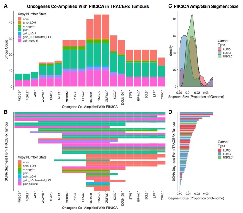
Extended Data Fig. 6. PIK3CA amplifications in the TRACERx 100 cohort.
a, Bar plot of oncogenes which are in close genomic proximity to PIK3CA and are gained or amplified (co-amplified) on the same SCNA segment with PIK3CA. The height of the bars represented the number of tumours that have the particular oncogene co-amplified with PIK3CA. b, Heat map indicating whether oncogenes are co-amplified on the same SCNA segment with PIK3CA. In a, b, genes are ordered on the basis of genomic location. The shading in the heat map indicates the type of SCNA affecting the genomic segment encompassing PIK3CA. As TRACERx data are multi-regional, some segments are assigned two different SCNAs (for example, “gain_neutral” indicates that this case harboured a subclonal gain in PIK3CA, where the gain was observed in some regions of that tumour, whereas other regions of that tumour were copy-number neutral at the same locus). c, Density plot indicating the frequency of the sizes of SCNA segments harbouring an amplification or gain involving PIK3CA. The distribution representing LUAD cases is indicated in red, the distribution representing LUSC cases is indicated in blue, and the distribution representing other NSCLC is indicated in green. d, Bar plot indicating the sizes of the SCNA segments harbouring the PIK3CA gain or amplification for each TRACERx case. Bars are coloured according to cancer type (red, LUAD; blue, LUSC; green, other NSCLC). SCNA segments in b, d are in the same order. Only TRACERx cases with a PIK3CA gain or amplification (n = 45 of 100) are included in this plot.

