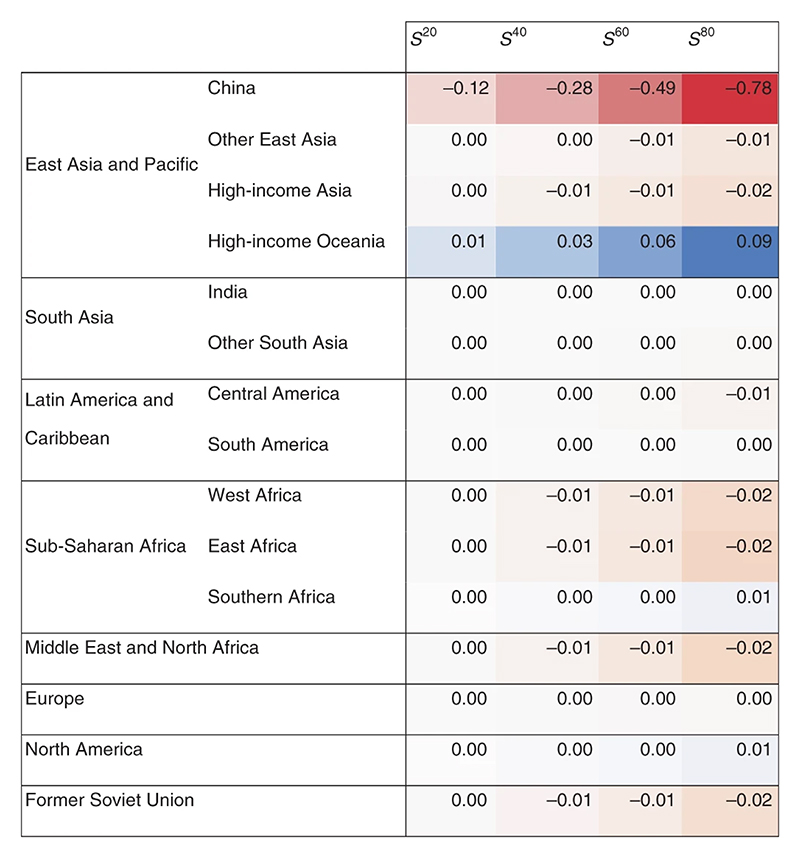
Fig. 4. Percentage change in average household welfare by region and scenario.
The heat chart uses two colour schemes reflecting the fact that the impacts in China are ten times higher than in other regions. Changes in China are in red and range from 0 (white) to -1% (red). A different scale is used for other regions where blue reflects welfare improvements (up to 0.1%) and orange reflects welfare reductions (up to -0.1%).

