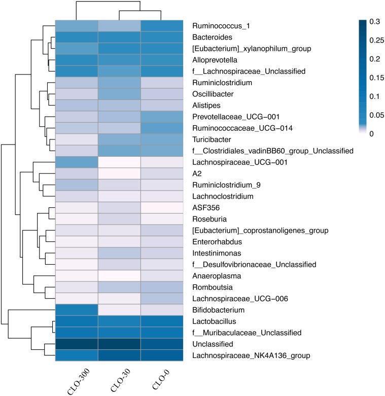
Fig. 9.
The distributions of the 30 most abundant species of each group at the Genus level were clustered and plotted in a heatmap. Similarities and differences in each species are visualized by the color scheme in the heat map. The columns represent groups and the rows represent species. The dendrogram above the heatmap shows the cluster results for the samples and/or groups, and the dendrogram to the left shows the species cluster. The colors in the heat map represent the relative abundance of the corresponding species in the corresponding group.

