
Fig. 6.
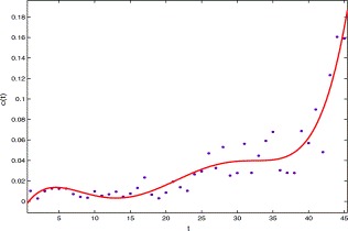
The graph of the per capita removal rate of probable class versus time t, the solid line is made from c(t) and the dots are made from the data in Table 1.
Official websites use .gov
A
.gov website belongs to an official
government organization in the United States.
Secure .gov websites use HTTPS
A lock (
) or https:// means you've safely
connected to the .gov website. Share sensitive
information only on official, secure websites.
The graph of the per capita removal rate of probable class versus time t, the solid line is made from c(t) and the dots are made from the data in Table 1.