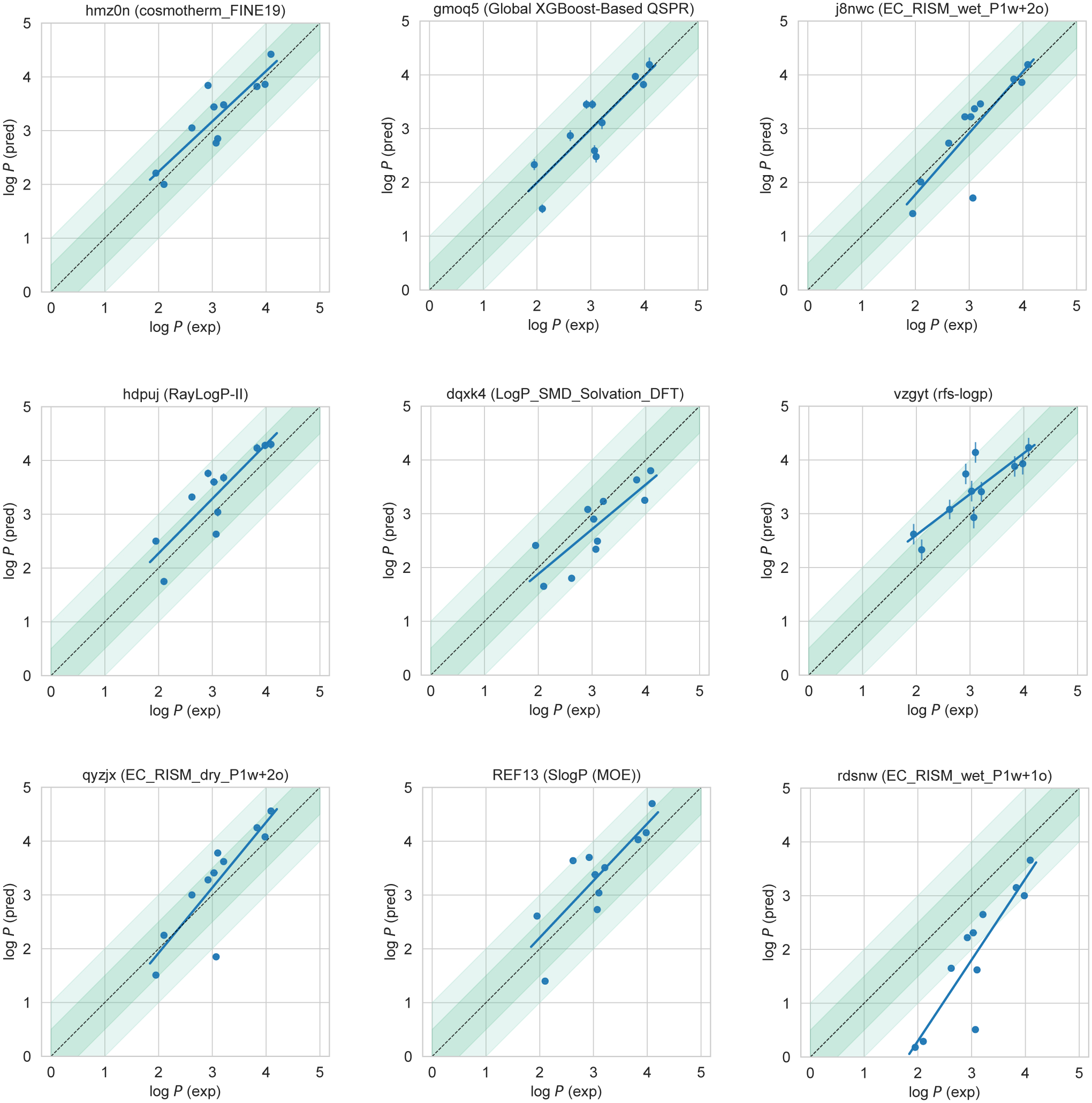
Figure 6. Predicted vs experimental value correlation plots of 8 best-performing methods and one representative average method.

Dark and light green shaded areas indicate 0.5 and 1.0 units of error. Error bars indicate standard error of the mean of predicted and experimental values. Experimental log P SEM values are too small to be seen under the data points. EC_RISM_wet_P1w+1o method (rdsnw) was selected as the representative average method, as it is the method with the highest RMSE below the median.
