FIGURE 2.

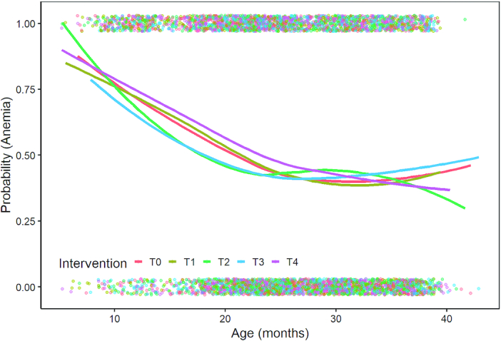
The prevalence of anemia by intervention group over child age. Dots represent individual data points, whereas lines represent lowess plots by group combining data from all survey rounds.

The prevalence of anemia by intervention group over child age. Dots represent individual data points, whereas lines represent lowess plots by group combining data from all survey rounds.