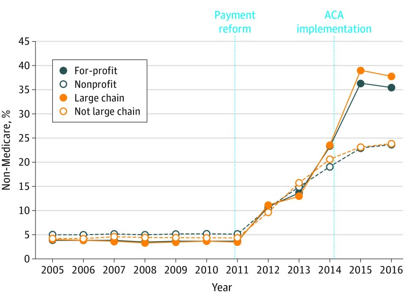
Figure 2. Annual Change in Non-Medicare Enrollment by Dialysis Facilities’ Profit and Large Chain Status, 2005-2016.
The figure shows the mean percentage of patients at the facility level who do not have Medicare coverage. Facilities are categorized by affiliation with 1 of the 2 largest dialysis chains and by profit status. These 2 categories are highly collinear with a correlation of 53.3%. ACA indicates Affordable Care Act.

