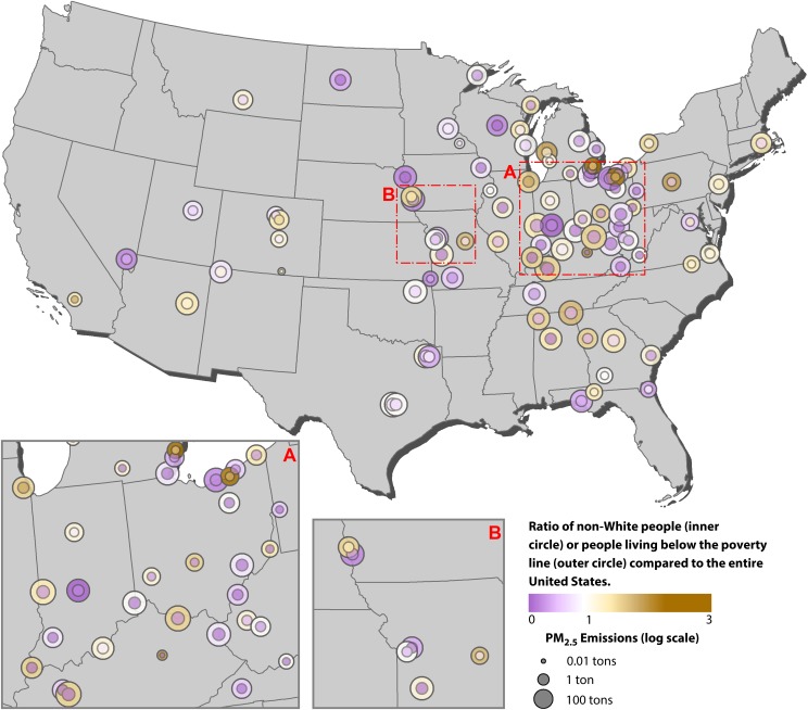
FIGURE 1—
Spatial Distribution of Coal-Fired Electricity-Generating Units That Were Retired Between 2015 and 2017: United States
Note. Close-ups are provided for areas with numerous plants in Indiana, Ohio, and parts of Illinois, Michigan, Pennsylvania, Kentucky, West Virginia, and Virginia (A) and for parts of Nebraska, Kansas, Iowa, and Missouri (B). Each circle represents 3 pieces of information. The size of the outer circle (shown below the map) is related to the fine particulate matter (PM2.5) emissions of each facility on a log scale. The color of the inner circle (given by the color bar below the map) represents the ratio between the percentage of non-White people assigned to the facility via the centroid containment method and the overall percentage of non-White people in the United States (38%). The color of the outer circle represents the ratio between the percentage of people living below the poverty line assigned to the facility via centroid containment and the overall percentage of people in the United States living below the poverty line (15%). For both race/ethnicity and poverty, a ratio of 1 (shown in white) means that the population matches the overall composition of the US population. Only the continental United States is shown because no facilities were retired in Alaska or Hawaii during the study period.

