
Figure 3.
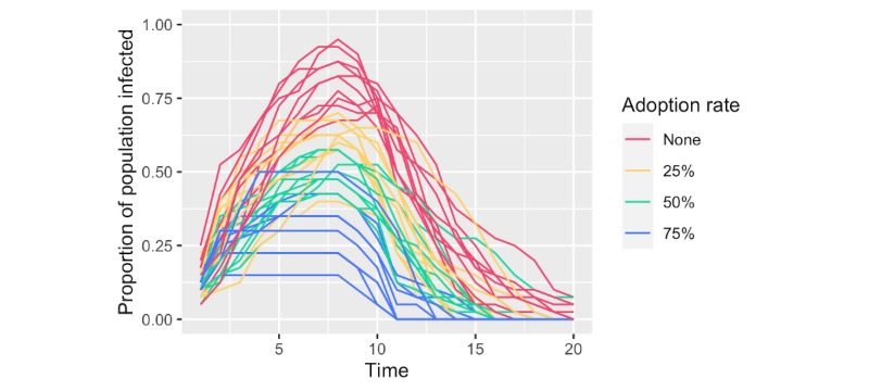
Comparison of infection curves from simulations at varying rates of peer-to-peer contact tracing application adoption. The proportion of the population with active infection is plotted across time for multiple adoption rates. Time is an arbitrary unit that represents the sequence of events in the simulation. The results of 10 random simulations per adoption rate are given.