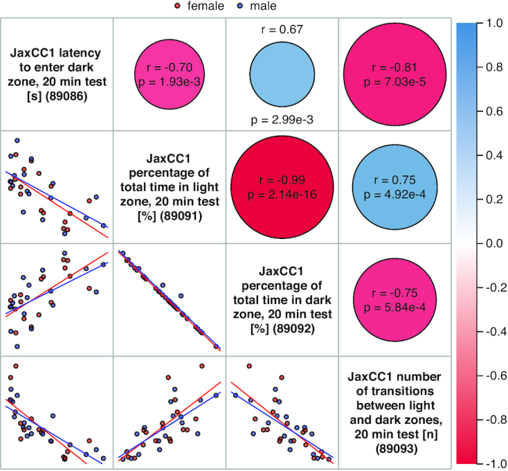
Figure 1.

Scatterplot and Correlations tool. Below the diagonal, female (red) and male (blue) data points are seen along with regression lines in thumbnail scatterplots. Above the diagonal in cells corresponding to scatterplots, positive correlations are in blue and negative correlations are in red. Pearson correlation coefficients (r) and P-values are indicated for each associated scatterplot. Clicking on the measure name along the diagonal will take users to a plot of that measure with summary statistics (not shown). Clicking on any other cell above or below the diagonal will take users to a larger, more detailed scatterplot with various viewing options (not shown).
