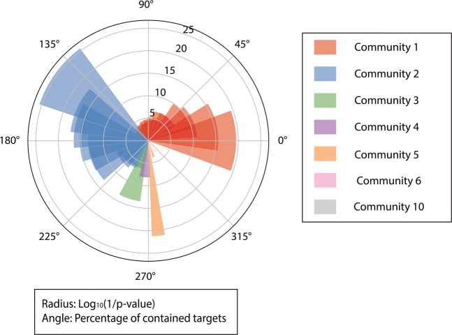
Figure 4.
Distribution of proteins in the communities and p-values for protein-pathway mapping results. The radius represents the log10 (1/p-value) of a mapping, and a higher bar has a smaller p-value. The angle of the bar represents the percentage of proteins contained in the mapped community. Shades in same color indicate multiple pathway-matchings of one community. P-value is calculated by Fisher’s exact test and all terms are adjusted by Benjamini-Hochberg FDR. Figure generated with matplotlib (https://matplotlib.org/) version 3.1.363.

