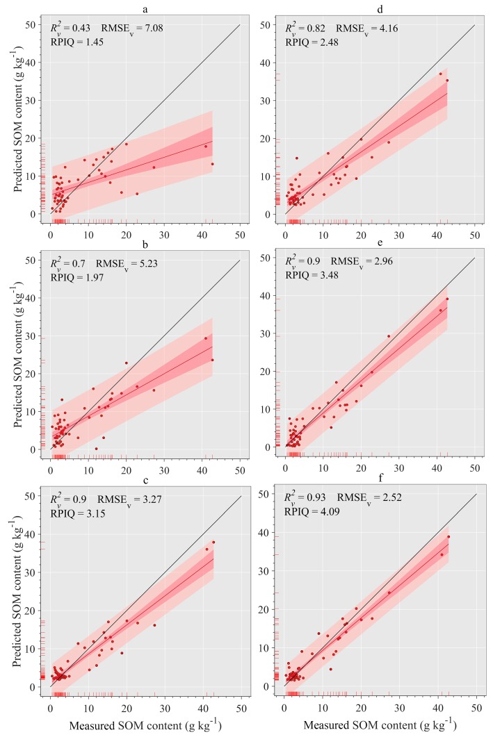
Figure 11.
Comparison of measured versus predicted SOM content (n = 56) based on the RF model with various modeling strategies. The salmon area (relatively wide area) and crimson area (relatively narrow area) cover the predicted SOM data and its fitting line with 95% probability, respectively. Red and blue lines represent the fitting line and 1:1 line between the measured and predicted SOM content, respectively.

