
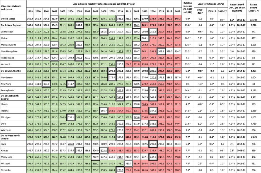
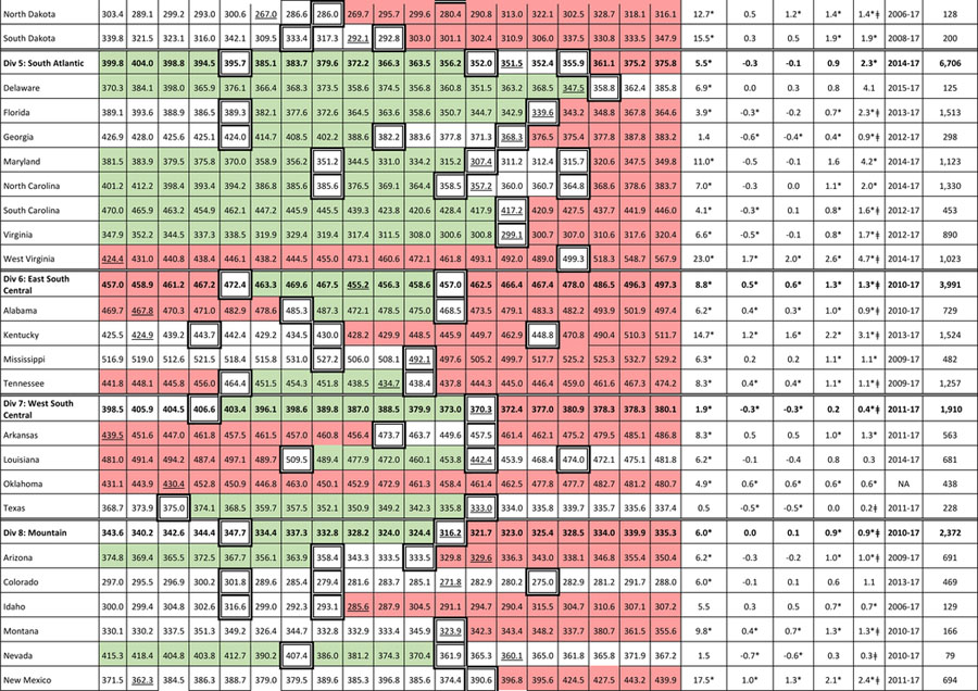
Table 2.
Age-adjusted all-cause mortality rates, adults ages 25–64 years, for the US, census divisions, and states (1999–2017)
 |
 |
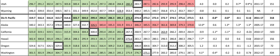 |
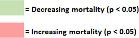
Table presents age-adjusted, all-cause mortality rates (per 100,000) among US adults ages 25–64 years for 1999–2017, along with the relative increase in mortality rates between 1999 and 2017, and the slopes modeled by the Joinpoint Regression Program. See text and Supplement for methods. Slopes presented here include the average annual percent change (AAPC) for three time periods—1999–2017, 2005–2017, and 2010–2017—and the annual percent change (APC) for the most recent linear trend in the joinpoint model. Also shown are the estimated number of excess deaths in the US caused by year-to-year changes in midlife mortality rates between 1999 and 2017. Green shading depicts years during which mortality rates decreased (statistically significant negative APC), red shading denotes years of increasing mortality (statistically significant positive APC), and cells with no color depict periods when the APC did not differ significantly from zero. Cells with bolded borders denote joinpoint years, when changes occurred in the modeled linear trends. Underlined mortality rates denote the lowest mortality rates (nadir) for 1999–2017. Asterisks (*) denote a slope (APC or AAPC) that differed significantly from zero (p < 0.05) and hashtags (ǂ) denote a statistically significant slope change estimate, a measure of the change in slope from that of the previous time period; see Table e7 for 95% confidence intervals. NA = Not applicable; joinpoint plotted a single trend line for 1999–2017, thus no last segment. Mortality rates obtained from CDC WONDER.