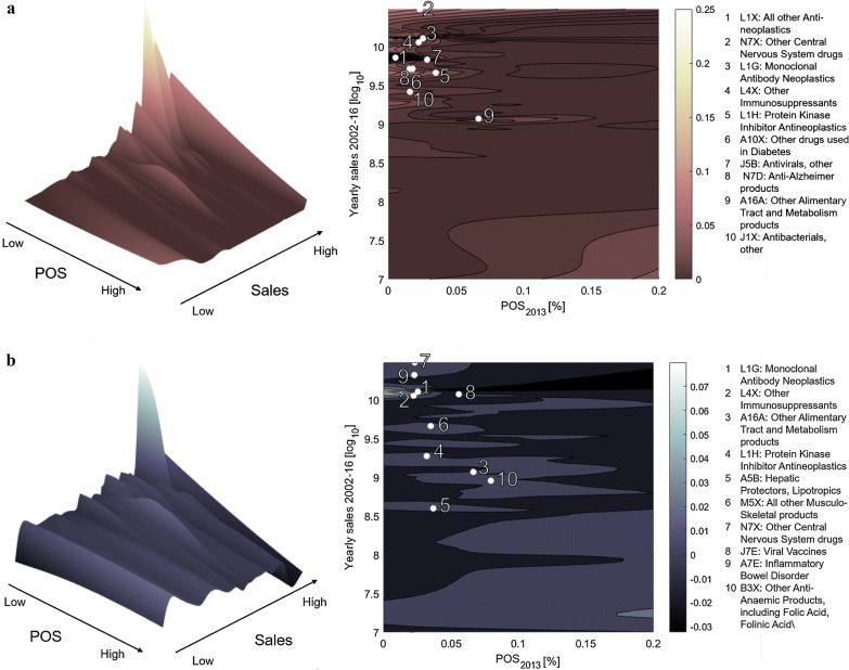
Fig. 3.
Distribution of R&D projects, by probability of success and size of the market. In each panel, the probability of success (POS) is shown on the x axis and the logarithm of potential sales (yearly average computed in 2002–2016) on the y axis. A contour plot and a three-dimensional view of the same distribution are shown. In the contour plot we highlight the top 10 ATC3 classes by the focal metric being shown on the vertical axis. These are listed besides the contour plots. a The vertical axis shows the percentage distribution of research and development (R&D) projects by POS and sales level. The distribution of R&D efforts is concentrated in the upper left hand corner of the plot (indicating high sales and low POS). b The vertical axis shows the share variation between 2002–2009 and 2010–2017, again as a function of POS and sales. Positive values (peaks in the plot) represent areas in which the research efforts have increased from 2002–2009 to 2010–2017, whereas negative values (holes in the plot) correspond to a reduction of research intensity

