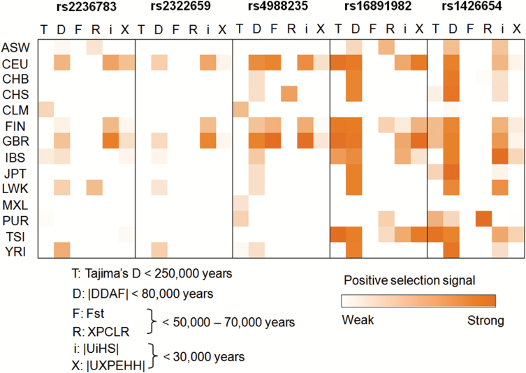
Fig. 1.
Positive selection heatmap for 5 positive control SNPs. Each single box with border represents a single SNP. Within each box, the horizontal row shows the statistical value of 6 positive selection tests and the column represents 14 different populations. For a given SNP, the maximum positive selection signals that could occur was 6 tests × 14 populations = 84. The red blocks indicated the positive selection signals observed in a specific test-population combination. The detailed statistical results were provided in supplementary table S3. The numbers following each test (ie, <250 000 years) represent the approximate time before the present over which the test can detect positive selection.

