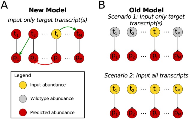
Fig 3. Diagram of transcript-protein models.
(A) Diagram describing our model which includes positive (green arrows) and negative (red arrows) influences among the monolignol transcripts and proteins defined by B (Eq (3)). Using only targeted input abundances (yellow), the other untargeted monolignol transcripts and proteins are predicted (red) (B) In the old model only the one-to-one relationships from a monolignol transcript to its protein were included. In scenario 1, only the targeted monolignol transcripts were used as input abundances (yellow), the untargeted transcripts remained at wildtype levels (gray) and the protein abundances were predicted (red). In scenario 2, all of the monolignol transcript abundances were used as input (yellow) to predict (red) the monolignol protein abundances.

