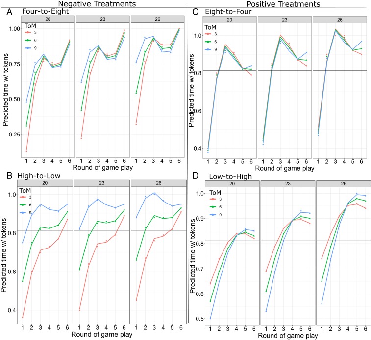
Fig. 3.
Three-way marginal effect plots. Green curves illustrate groups with mean scores, blue curves one SD above mean , and red curves one SD below. In each set of three graphs, panels move from one SD below the mean group score (estimated by ACT) to the mean to one SD above. (A) Four-to-eight group size (negative) perturbation treatment. (B) High-to-low growth rate (negative) perturbation treatment. (C) Eight-to-four group size (positive) perturbation treatment. (D) Low-to-high growth rate (positive) perturbation treatment.

