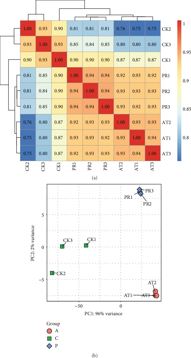
Figure 6.

(a) Heat map of hierarchical clustering for gene expression levels in nine samples. The darker the color is, the greater the correlation is. (b) Principal component analysis (PCA) of nine samples. The closer the points of the same color are, the better the aggregation is.
