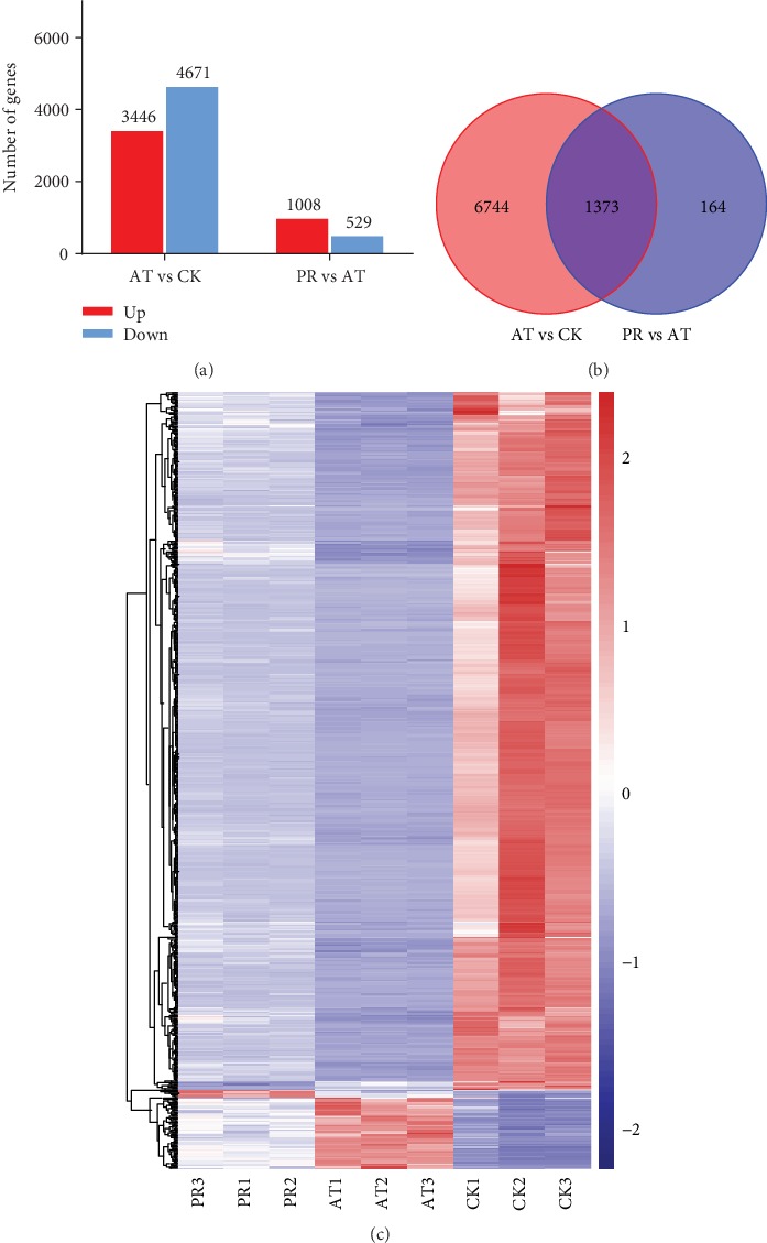
Figure 7.

(a) The statistical maps of differentially expressed genes (DEGs) upregulated and downregulated the situation among AT vs. CK and PR vs. AT. (b) Venn diagram comparing the DEGs between AT vs. CK and PR vs. AT. (c) The cluster heat maps of DEGs among CK, AT, and PR. Columns and rows represent samples and genes. Legend represents the log2 (fold change) of gene abundance; the redder the color, the higher the gene expression, and conversely, the bluer the color.
