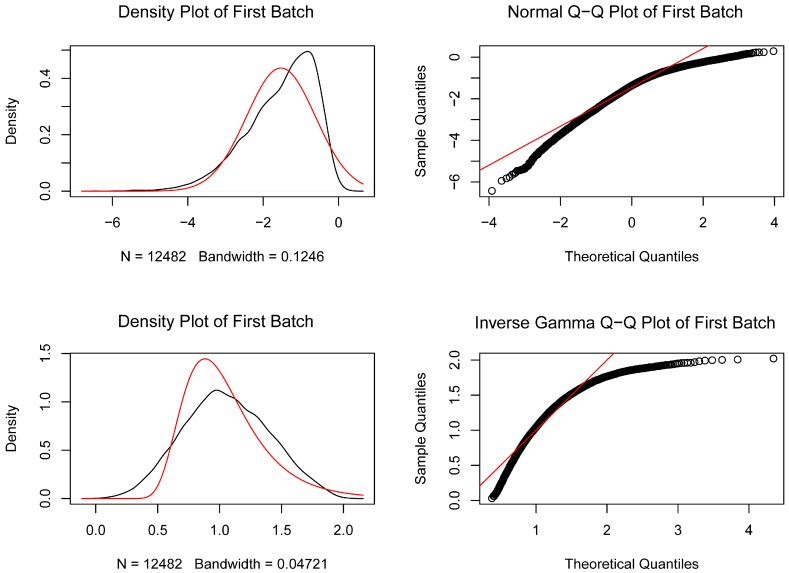
Figure 1.
The quantile–quantile (Q-Q) plot of the inter-batch difference of GSE55235 and GSE55457 datasets is removed. The red line represents the density map of the GSE55235 data distribution, the black line represents the density map of the GSE55457 data distribution, and the black circles represent the quantiles corresponding to the same cumulative probability.

