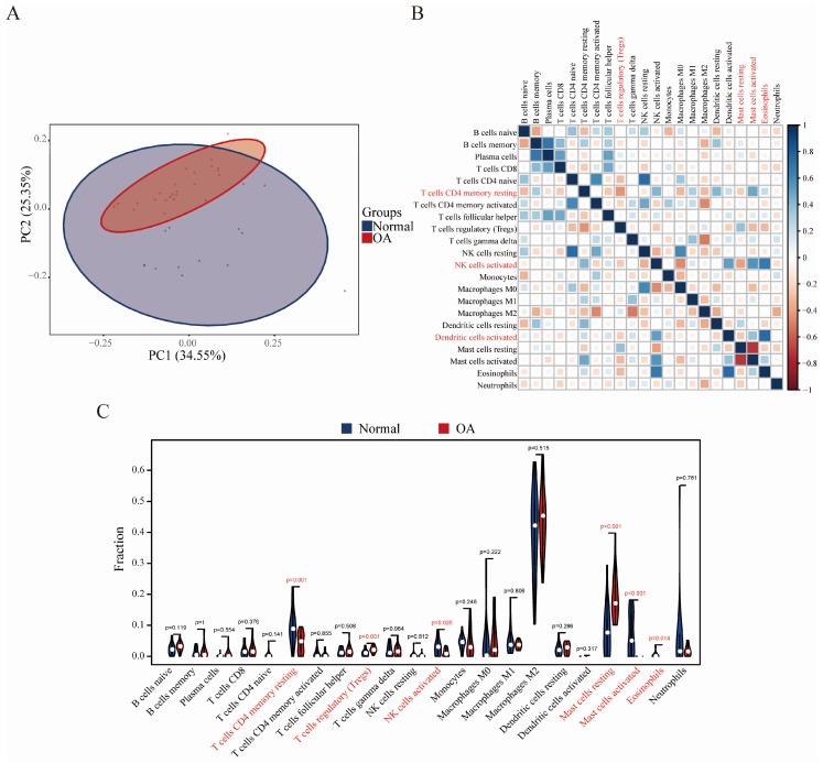
Figure 6.
Evaluation and visualization of immune cell infiltration. (A) PCA cluster plot of immune cell infiltration between OA samples and control samples. (B) Correlation heat map of 22 types of immune cells. The size of the colored squares represents the strength of the correlation; blue represents a positive correlation, red represents a negative correlation. The darker the color, the stronger the correlation. (C) Violin diagram of the proportion of 22 types of immune cells. The red marks represent the difference in infiltration between the two groups of samples.

