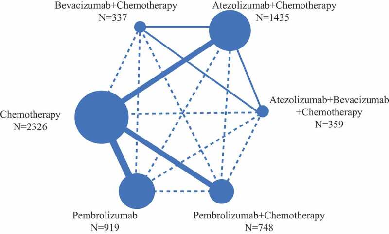
Figure 2.

Network structure for all the included trials. Each circular node represents a treatment type. The circle size is proportional to the total number of patients. The width of lines is proportional to the number of studies performing head-to-head comparisons in the same study, and the dotted line is the indirect comparison which was shown in this NWM.
