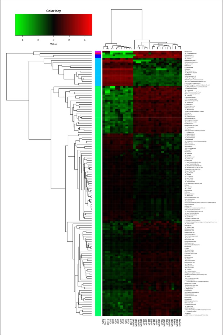
Fig. 2.
Heatmap analysis of the blood metabolite patterns in MHD patients and healthy controls. The heatmap shows the significantly changed metabolites between the 2 groups. Each column in the heatmap represents one sample, and each row represents one metabolite. The color bar showing green to red indicates the relative content of metabolites.

