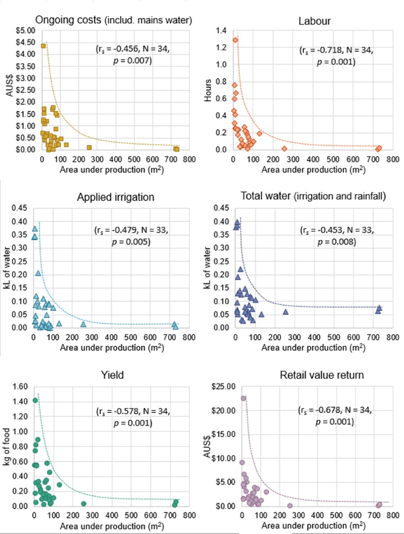
Fig 3. Scatter plots of the negative correlation between area under production and the inputs and outputs.

All values are presented as per square metre per 30 days. The lines represent the upper envelope of the results.

All values are presented as per square metre per 30 days. The lines represent the upper envelope of the results.