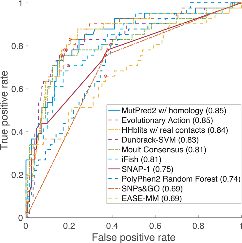
Figure 2.
ROC curves for each team’s top performing model when using 0.15 observed fwt activity as the threshold at which pathogenic and benign mutations are distinguished (Predictor Performance Evaluation). Red dots represent the positions in each ROC curve closest to the upper left-hand side of the plot and were calculated by finding the point with the lowest square root of the sum of the square of the false positive rate and false negative rate.

