
FIGURE 3.
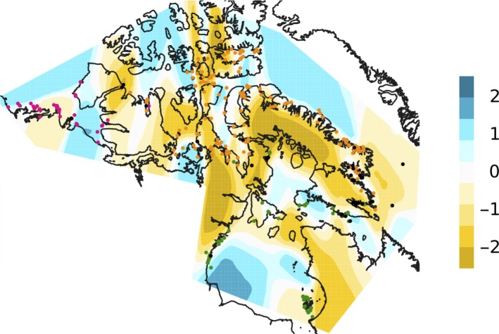
The EEMS contour plot of effective migration rates. The scale is log10(migration), relative to the overall migration rate across the modeled area. Points are the sampling locations of the polar bears, colored following Figure 1. Areas at the dark yellow end of the spectrum exhibit on average higher‐than‐average isolation‐by‐distance