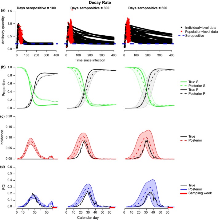
Figure 3.

Model performance as a function of antibody decay rate. (a) Black lines show the transformed antibody quantity every 4 days for simulated experimental individuals known to be inoculated at time 0 (y 1i). Red dots show the transformed antibody quantities in all seropositive individuals sampled cross‐sectionally on day t in a simulated population experiencing disease transmission (y 2j). The blue dotted line indicates the threshold for seropositivity (y*). Parameters are given in Supporting Information 3. (b) Posterior estimates for number of individuals in susceptible (green dashed) and seropositive (black dashed) states relative to the true values (solid lines of corresponding colours). (c) Model fits (red) to the true incidence over time in the simulation model (black). (d) Model fits (blue) to the true FOI over time in the simulation model (black). (b–d) Shaded areas show 95% credible intervals for the estimates. The red bar along the bottom indicates the sampling period for b–d.
