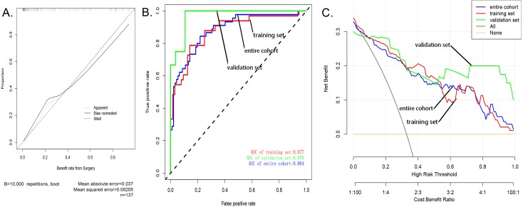
Figure 3. Evaluation of the nomogram prediction model.
(A) A calibration curve for the predictive model of sarcopenia in cases of patella fracture. Note: The x-axis is the risk of sarcopenia. The y-axis represents the actual incidence of sarcopenia. The diagonal dashed line represents a perfect prediction of an ideal model. The solid line indicates the predictive power of this predictive model, and the more it fits with the dotted line, the better the predictive ability. (B) The area under the curve (AUC) of the sarcopenia prediction model indicates the probability of accurately predicting whether or not the patient has sarcopenia in a randomly selected case. The model exhibited good predictive power, and the AUC values of the training group (red), the test group (green), and the whole sample (blue) are 0.8917397, 0.9476584, and 0.9114173, respectively. (C) The decision curve of the nomogram. The figure shows the decision analysis curves for training, test, and overall groups.

