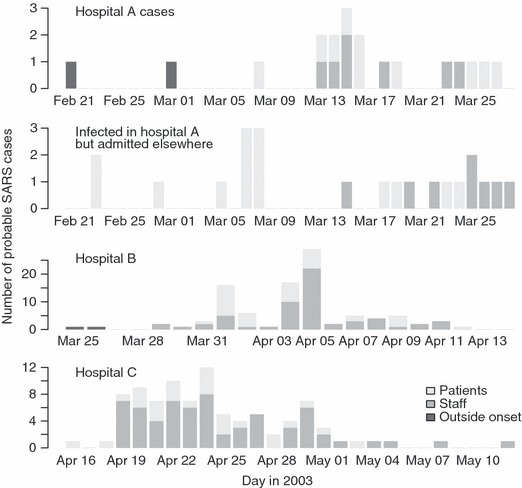
Figure 1.

Epidemic curves for hospitals A, B and C. The top panel shows cases who were admitted to hospital A. The first two of these were believed to have been index cases who were infected from sources outside hospital A. The panel below this shows cases believed to have been infected in hospital A, but who, on developing symptoms, were admitted to other hospitals. These people include both staff at hospital A (dark grey bars) and visitors to hospital A patients (light grey bars). Cases infected in hospitals B and C (bottom two panels), in contrast, were treated in the same hospital.
