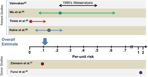
Figure 2.

CMV risk: historical data and recent studies. The graph depicts the per‐unit risk as quantified in the different publications. The circles indicate the mean values. Patient studies are grouped above and donor studies are depicted under the x‐axis. The length of the arrows corresponds to the 95% confidence intervals, when reported, or high and low estimates. The overall estimate is depicted with the vertical arrow above the x‐axis and takes into account that only the approximately 50% of patients who are CMV seronegative are at risk for acquiring TT‐CMV.
