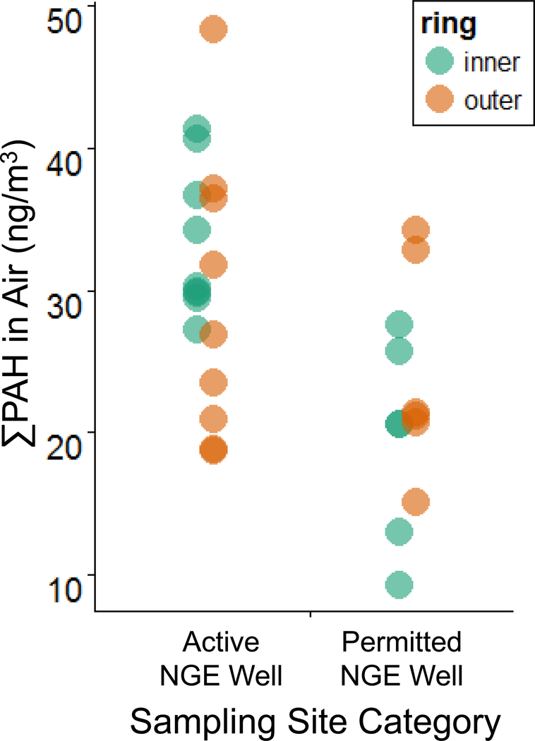
Figure 5.
∑PAH concentrations in participants’ wristbands (ng/g wristband). Participant groups describe the proximity of a participant’s home or workplace to the nearest active NGE well. Horizontal lines inside each box represent the median ∑PAH concentration in each participant group. Notes: This is not currently included in the main text or SI. I made it a while back while we were exploring the data. I added it here for consideration, in response to comments on the call last week about the mapping figures perhaps not making it super easy to see the PAH concentration trends among active and permitted well sites. We could consider adding something like this (either into Figure 1, or as an additional figure). I think it would require some beautification and modification if wanted to do that. Also, we could also consider adding visual representation of the medians to this figure (such as horizontal lines as we’ve done before) Maybe try to make this into a summary graphic to add to and/or add into F1 – at least SI? Might be more helpful if could add line for avgs or something – see cfish paper for example of R code.. PAHs measured by stationary air samplers in May 2014 in Ohio (F14–15), >>PAH levels are significantly higher at sites with wells in the inner ring of samplers (Wilcoxon Rank sum test, p = 0.000799). However, PAH levels are not significantly different between sites with and without a well in the outer ring of samplers (Wilcoxon Rank sum test, p = 0.456), LBP, 5/5/16 >>so, perhaps we should use the inner ring of samplers when we compare air levels at the stationary sites to wristband levels for participants matched to these sites. Because the inner ring levels seem to vary more with site.

