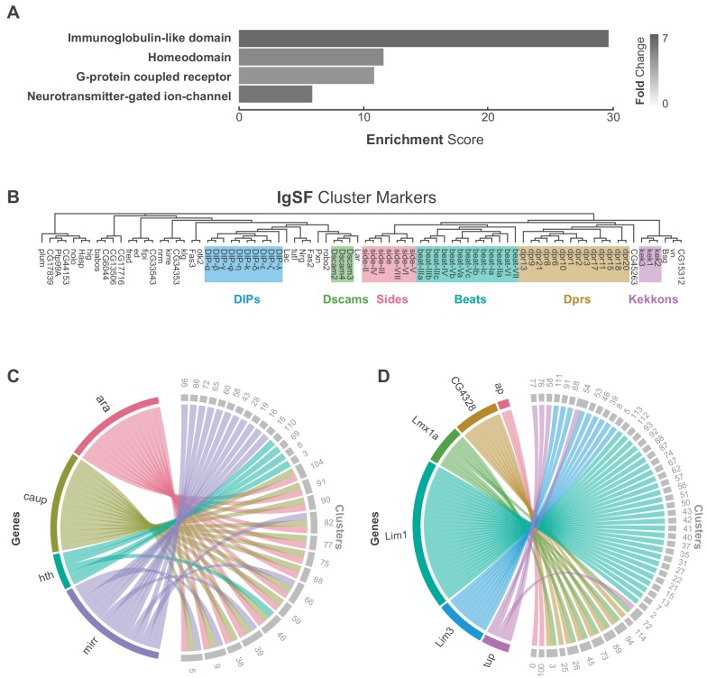
Figure 2. Characterization of neuronal cluster markers.
(A) Functional analysis of neuronal cluster markers (DAVID) showing representative functional terms (>5 fold-change) and their corresponding enrichment scores (representing mean p-values). (B) Phylogenetic tree of IgSF neuronal cluster markers. IgSF subfamily members are highlighted in color. (C) Chord diagram comparing the relationship between Tale Homeobox TF cluster markers (left) and the clusters in which they are significantly enriched (right). (D) Chord diagram comparing the relationship between LIM Homeobox TF cluster markers (left) and the clusters in which they are significantly enriched (right). (B–D) Gene were classified based on Flybase Gene Group annotations (www.flybase.org). (C,D) Chord diagrams are visual aids based on data available in Figure 1—source data 1.

