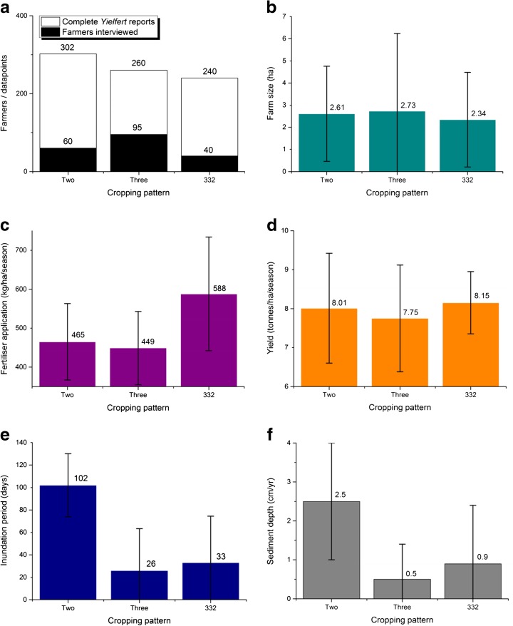
Fig. 2.
Graphs summarising the survey results in each cropping category. Graph a shows the number of farmers interviewed and the number of complete Yielfert values they supplied. Graph b shows the mean farm size and standard deviation. Graph c shows the mean seasonal fertiliser application and standard deviation. Graph d shows the mean yield and standard deviation. Graph e shows the mean period of inundation and standard deviation. Graph f shows the annual sediment deposition depth and standard deviation

