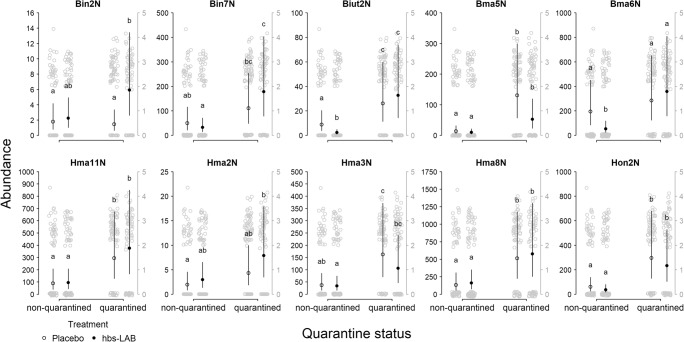
Fig. 3.
Abundance of each hbs-LAB found in a sample with qPCR. The black dots show the predicted marginal means with confidence limits from the statistical model. The gray dots (with a separate scale in gray on the right side) show the original data (log10 transformed after addition of one to show zero values). Different letters indicate significant differences between treatments-quarantine status combinations within each hbs-LAB

