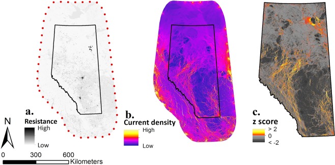
Figure 2.
Main map computation pipeline. Main map was calculated using an average combination (HFU) of physical human footprint, HF, and intensity of human use, HU, resistance values. Map (a) shows resistance map calculated at 100 m resolution where darker values represent high resistance and brighter values represent lower resistance (red dots, nodes used to compute the following current density map). The map was computed in R 3.4.283 and QuantumGIS80. Map (b) is the current density map resulting from GFlow’s49 electric current simulation at a 100 m resolution. Red to yellow colour ramp represents higher values of current density while darker purple to blue colour ramp represents lower values of current density. Map (c) is clipped to Alberta extent and current density values were standardized and centred at a 100 m resolution. Hot colour ramp represents important connectivity cells with a z > 0, and grey scale colour ramp represents unimportant connectivity cells with z < 0. The map was computed in R 3.4.283.

