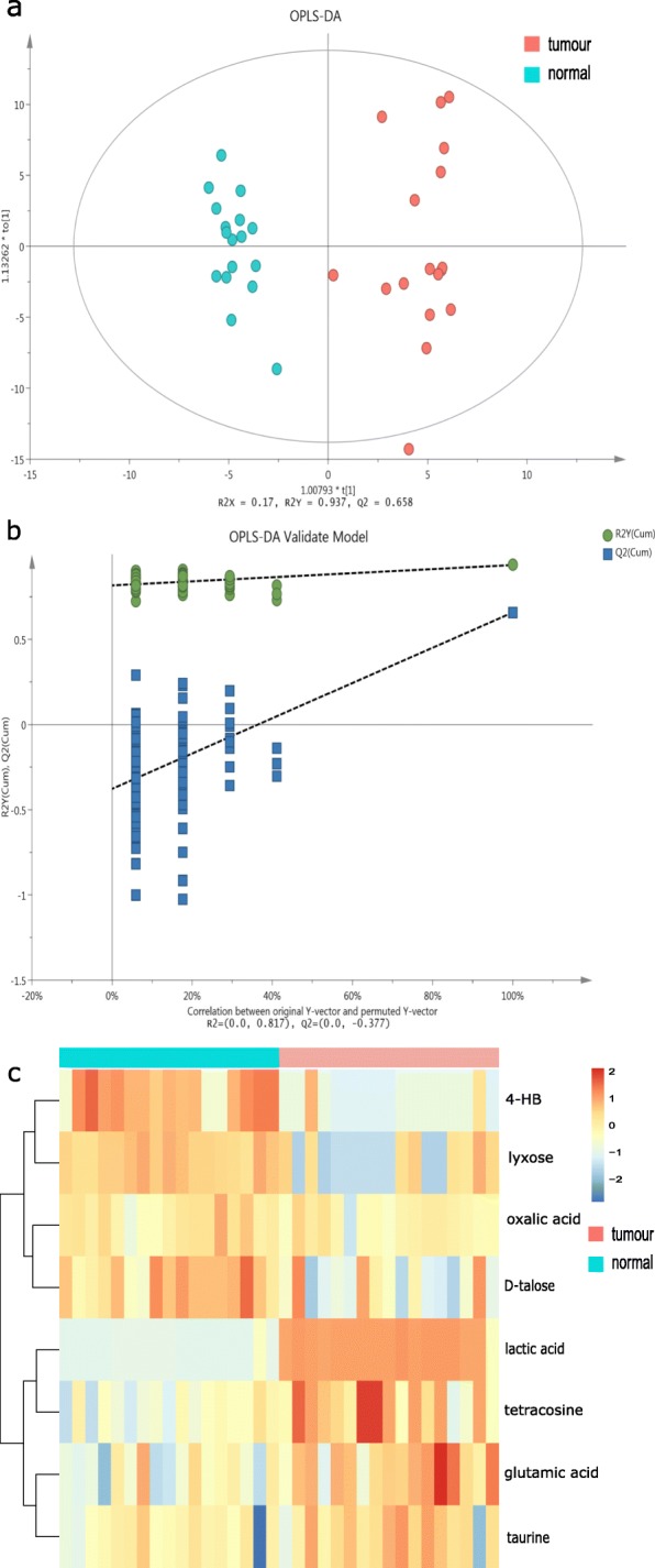
Fig. 3.

Comparison of the mucosal metabolome between tumour tissues and normal tissues in CRC patients a. OPLS-DA scores plot of metabolome between tissue samples. Each point represents one sample with colour indicating tumour tissues (red) and adjacent normal tissues (blue). b. OPLS-DA model validation based on seven-fold cross-validation and 200 permutation tests. Y axis: the R2 (green; goodness of fit) and Q2 (blue; predictability) of the all newly calculated and the original OPLS-DA models. X axis: correlation between the original Y observation and the permuted Y observation. R2inter and Q2inter are the intercept of the linear regression of R2 and Q2 from random models against those from original model. The negative Q2inter indicated the validity of the model. c. Heatmap visualizing the significantly differentially abundant metabolites between tumour (red) and normal tissues (blue) based on hierarchical clustering analysis. The rows demonstrate the metabolites and the columns display samples
