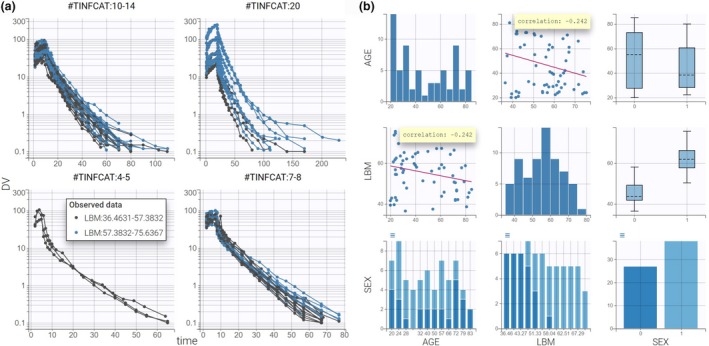
Figure 1.

Data visualization with Datxplore. (a) Spaghetti plot of remifentanil concentrations (y axis) with respect to time (x axis) split by TINFCAT and colored by LBM. (b) Covariate viewer with LBM, AGE, and SEX selected. Correlation coefficients are overlaid on the scatterplots. DV, observed concentrations; LBM, lean body mass.
