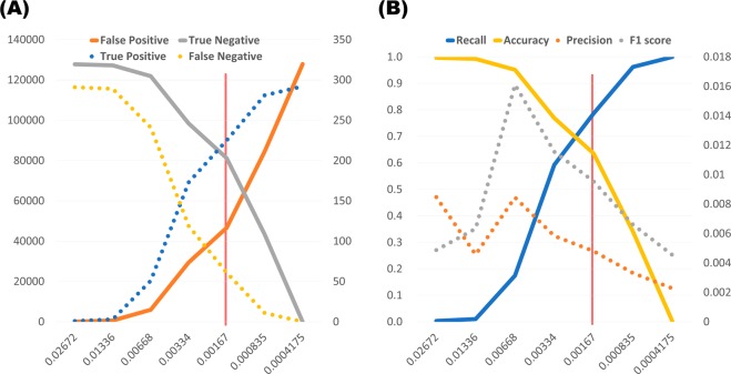
Figure 6.
Trade-off line graph according to various cut-off probabilities calculated by XGB model. The x-axis indicates probability values calculated from the model. The scale of the solid line is shown on the left axis, and the scale of the dotted line is shown on the right axis. The red vertical line indicates the optimal cut-off value maximizing sensitivity + specificity. (A) Trends of the number of predictions. The y-axis represents the number of subjects. (B) Trends of performance indicators. The y-axis represents the performance scores.

