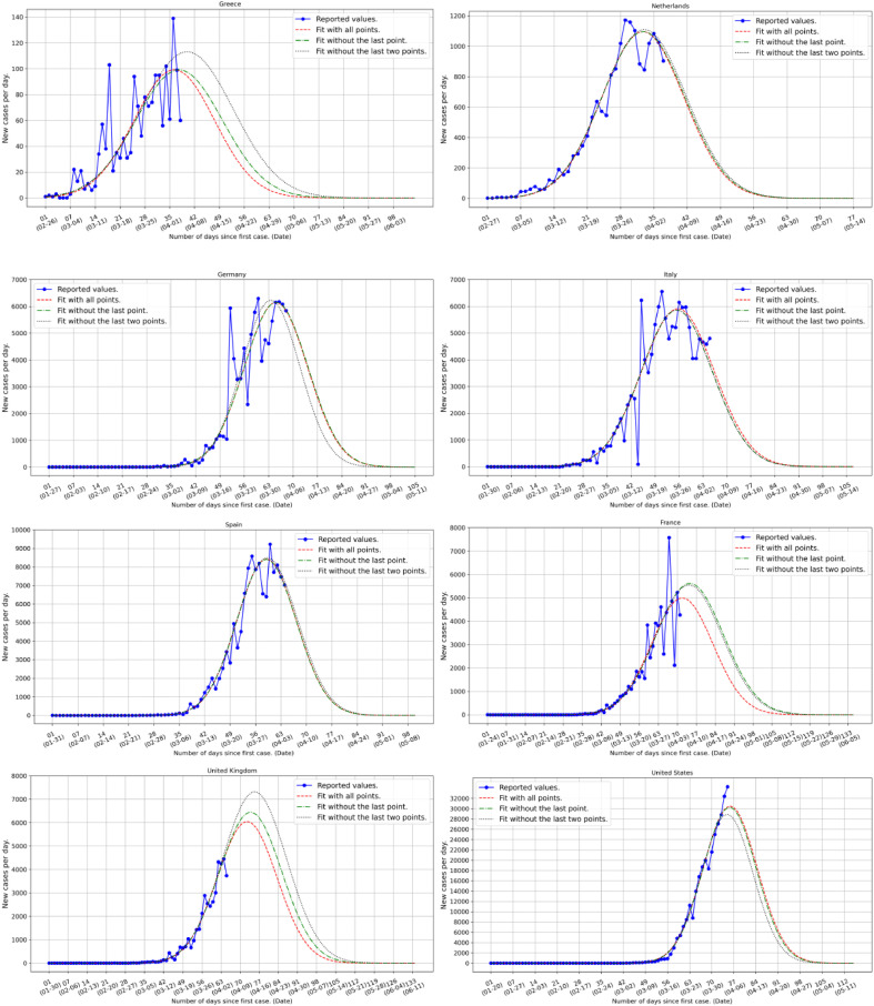
Fig. 1.
Country level estimates of daily number of infections based on the available country data (blue points and line) reported on April 4, 2020 [4]. The red dashed lines give the predicted evolution of the infection based on all available data up to and including the ones of the last reported day. The green dashed dotted lines include the data up to a day earlier than the last reported date while the black dotted lines include the data up to two days earlier than the last reported date. The difference in the three predicted curves, red, blue and black, reflects thus the relative robustness of the phenomenon and gives an estimate of the fluctuations. A more complete statistical analysis of the infection horizon will be presented as more data accumulate [5]. From the figures we see that, for instance, in the case of Greece where strict rules were imposed early, both the number of infections and the “flattening of the curve” is occurring in a rather controlled way while, on the contrary, in Spain the peak is more sharp and with a vastly larger number of infections.

