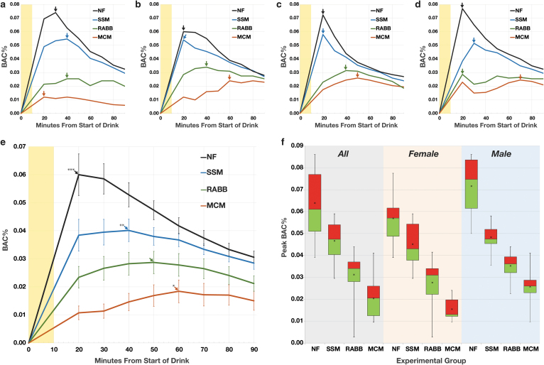
FIG. 2.
BAC measurements of the participants. (a–d) Example BAC-time plots of four participants, 10 minute duration of drinking is shaded yellow, pBAC for each plot indicated by arrow. (a) Sixty-four-year-old female. (b) Forty-two-year-old female. (c) Forty-year-old male. (d) Thirty-one-year-old male. (e) Graphs of the aggregated BAC-time plots for all 21 participants. Each datapoint represents the mean of all BAC values at a given timepoint, error bars are the 95% confidence interval. Arrows indicate the peak of the aggregated BACs, significant difference from RABB indicated by *P < .01, **P < .001, ***P < .0001. (f) Boxplots of the pBACs for all participants (n = 21), females (n = 11), and males (n = 10). The line separating the red and green is the median, the “x” marks the mean, box top and bottom marks upper and lower quartiles, whiskers define the total range of values. BAC, blood alcohol concentration; pBAC, peak BAC; RABB, reduced alcohol bioavailability bar.

