. 2020 Apr 1;9:e54532. doi: 10.7554/eLife.54532

Figure 6. Machine learning (ML) approach for predicting donor class.

(A) Brief pipeline of the ML analysis. Training set input into the pipeline are shown in green boxes. Steps of the ML analysis in purple boxes are associated with different panels of the figure. (B) Percent accuracy based on 10-fold cross validation (CV) for each of the trained ML models. (C) Confusion matrix from the best model (GDBT using 239 features). (D) Scatter plot showing the probability scores assigned for each predicted sequence by the predicted donor type. Colors indicate the confidence level of the prediction based on probability of assignment to a given donor class as well as confidence intervals of the predicted class i.e. difference in probability values between the 1st prediction class and the 2nd prediction class. (Figure 6—source data 2).

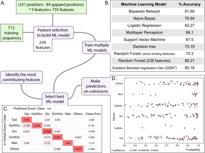
Figure 6—source data 1. List of the 713 training dataset sequences used for machine learning.
The ‘Assigned Donor Class’ column indicates one of the six classes the donor belongs to.
Figure 6—source data 2. Results for donor prediction using the GDBT ML model for GT-A sequences from five model organisms.
The validation datasets (highlighted in blue rows) include GTs that have some experimental characterization but were not included in the characterized dataset. The validation set was used to compare the model predictions with the experimental results. The ‘Match Experimental’ column indicates whether the prediction matched experimental results. The prediction set includes predictions for GTs of unknown functions. The ‘Confidence’ column includes the confidence for prediction which was derived based on the probability for the 1 st class and its difference with the probability for the 2nd class. Probabilities for all the six classes are provided in the ‘Classwise Probablity’ columns.

Figure 6.

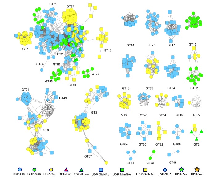
Figure 6—figure supplement 1. Sequence homology-based network of all the experimentally characterized sequences form the GT-A fold families.

Figure 6—figure supplement 1.

Nodes represent the sequences that were annotated as characterized and collected from the CAZy database to be used in the training dataset for ML. The color and shape of the nodes indicate the donor specificity for that sequence. An edge between two nodes indicate that the sequences are homologous with an e-value better than 1e-5. Smaller edge distance indicates a higher similarity between nodes. An edge-weighted spring embedded layout from Cytoscape was implemented to minimize edge crossings and enhance visual interpretability. At multiple locations in the network, closely related sequences differ in donor specificity, rendering prediction through similarity alone difficult.
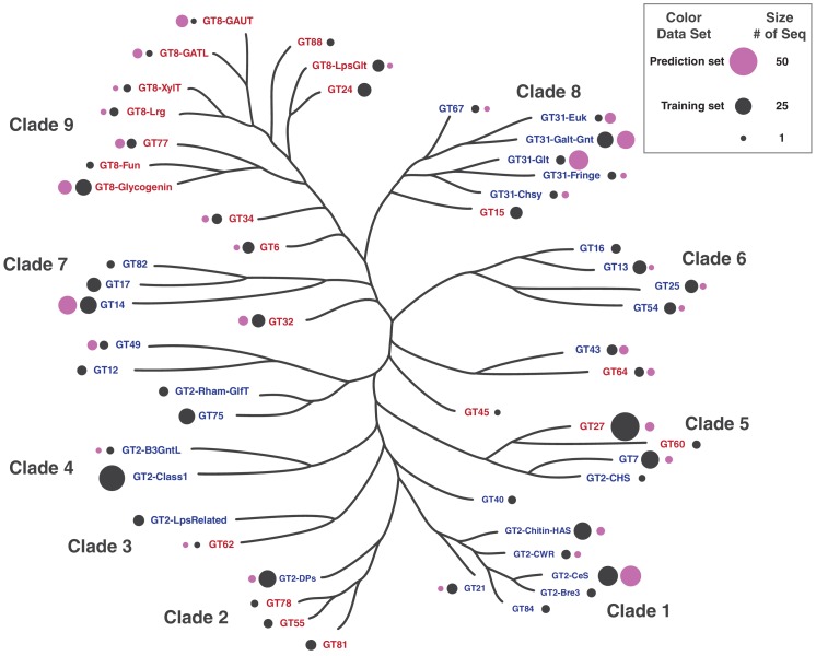
Figure 6—figure supplement 2. Distribution of training and prediction datasets used in machine learning.

Figure 6—figure supplement 2.

The size of the bubbles next to GT-A family names indicates the number of sequences in the training and prediction set from that family. Color of the bubbles indicate training or prediction set.
Figure 6—figure supplement 2—source data 1. Distribution of sequences across different families.
The counts in this table were mapped in to the phylogenetic tree in Figure 6—figure supplement 2.